A comparative pause
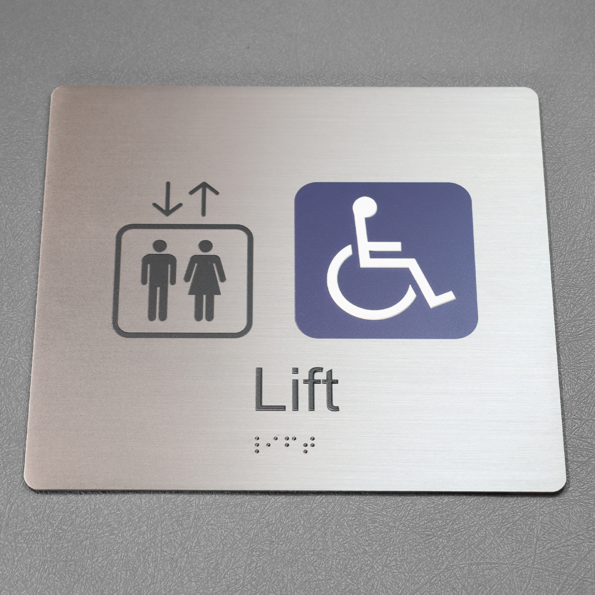
I’m thinking about signs as both language and instrument — how they convey a brand and how they translate into touch and sight. The shift from flat printed panels to aluminum sheet metal with embedded micro‑LEDs means we now read signs by light distribution and by feel: tactile lettering and braille dots sit beside carefully shaped light fields. That duality is why many facilities pair new builds with ada braille signs — they’re not decoration, they’re code in physical form. The Americans with Disabilities Act (see ADA Standards for Accessible Design, 2010) set basic rules for tactile signage, but the comparative question is practical: which approaches preserve legibility under changing light, and which simply look modern?

How next‑gen aluminum compares to older systems
Traditional acrylic or routed wood signs relied on surface finish and paint contrast. Aluminum substrates with micro‑LEDs change the variable set: you add photometric distribution and heat management to the list. Micro‑LEDs allow precise backlighting that improves contrast ratio without adding bulk. The result is cleaner edges and softer shadows, which help tactile lettering read more consistently for touch and sight.
Yet the new tech introduces pitfalls. Light bleed can wash out shallow braille dots. Thermal expansion in an aluminum sheet can nudge mounting tolerances. So the comparison isn’t a simple upgrade; it’s a trade-off matrix — materials, optics, and code all interacting. Small decisions early on determine whether signage becomes accessible or merely attractive.
Design considerations that actually matter
Begin with the fundamentals: mounting height, tactile depth, and contrast. Mounting height affects who can reach and feel tactile lettering; depth of tactile elements and the size of braille dots must meet the standard dimensions. Choose an aluminum alloy that resists warping and provides a stable platform for micro‑LED arrays. Photometric distribution needs testing under ambient and direct light — midday glare is unforgiving.
Practical checklist — short and unforgiving: – Verify tactile lettering meets required profiles. – Confirm braille dots are firmly formed and correctly spaced. – Test contrast ratio in situ, not just in the shop. These steps translate code into usable signs, not just checked boxes.
Common mistakes and sensible alternatives
A frequent error is prioritizing visual flair over touch clarity. Designers hide braille under gloss or crowd braille dots too close to decorative elements. Another common misstep is trusting specs on a bench rather than measuring photometric distribution after installation — what looks fine at five feet can blur at arm’s reach. — People assume LEDs solve everything; they don’t.
When micro‑LED integration proves problematic, sensible alternatives exist: routed aluminum with applied high‑contrast overlays, engraved plaques with inset LEDs for indirect illumination, or modular panels where tactile inserts are separate from the light source. Each alternative trades off seamlessness for serviceability, and that’s often a fair trade for long‑term compliance.
Three golden rules for evaluating sign systems
Measure for three practical metrics before committing: tactile fidelity, sustained legibility, and maintainability. Tactile fidelity means tactile lettering and braille dots conform to dimension and spacing standards. Sustained legibility covers contrast ratio across expected lighting conditions and predictable photometric distribution after hours. Maintainability asks whether an aluminum system with embedded LEDs can be serviced without replacing the whole face.
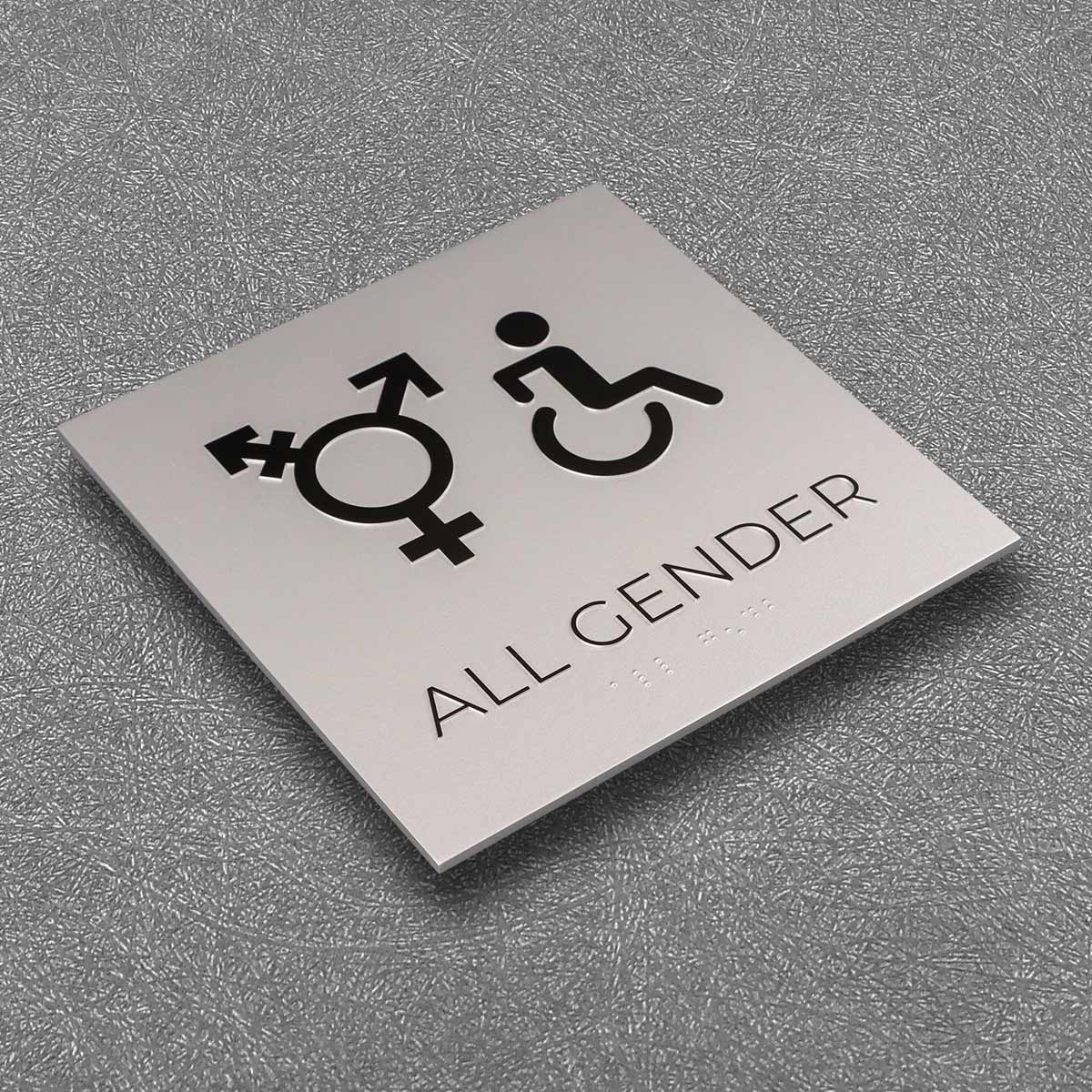
Use those metrics to compare vendors and prototypes. Look for real installations near similar climates or building types — real‑world anchors matter. For example, several municipal projects in New York retrofitted older signs to aluminum with embedded LEDs and documented improvements in night‑time legibility after addressing mounting and ventilation issues; that’s a useful benchmark.
When you want a partner that understands both tactile code and light engineering, choose a provider that documents tests, offers serviceable modules, and knows ADA nuance — naturally, that’s where practical value shows through Cosun Sign. Evidence of testing, disclosed material specs, and real installation photos are the signals of a team worth trusting.
Three quick rules: prioritize touch, verify light on site, and insist on replaceable modules. A small rigor that yields durable, readable signs. Final thought: clarity wins.